Uncoverideas,research,andstories.
Expert perspectives on brand strategy, digital design, marketing, and the future of business - from the Glodias team.
How a Startup Grew from Idea to Industry Leader
GrowthTech Solutions began as a small startup focused on helping businesses automate their customer support operations. Like many startups, the company faced challenges related to funding, customer acquisition, product-market fit, and scaling operations.
Abhishek
2026-06-17

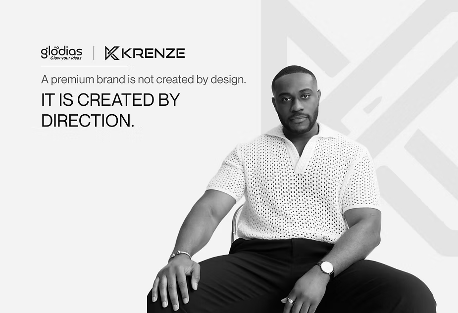
Building a Premium Clothing Brand’s Digital Presence with Glodias (Brand Building & Creative Agency)
Client: Krenze - a contemporary clothing brand dealing in T-shirts and jeans Agency: Glodias (Brand Building Agency & Creative Agency) Start: January 2026 Scope: End-to-end digital partnership - e-commerce, brand building, social media, creative & marketing The Partnership When Krenze came to us, Krenze wasn't just another clothing brand looking for a website. It was a brand with something real to offer - quality fabric, considered detailing, and a product that genuinely punched above its price point. What it needed was a digital team that could see that, and build everything around it. That's where Glodias came in. We took on Krenze as a full-stack digital partner. Not just to deliver a store and hand over the keys - but to own the brand's entire digital identity: how it looks, how it speaks, how it sells, and how it grows. E-commerce development, brand strategy, social media, content, campaigns, UX - all of it, under one roof, in lockstep. This case study covers Phase 1: Research, Strategy, UI/UX Design, and E-commerce Launch. First, We Had to Understand What We Were Actually Working With Before we opened a single design file, we did something most agencies skip in the rush to deliverables - we studied the product. And what we found changed the direction of everything. Krenze's quality - the fabric weight, the construction, the attention to detail - wasn't budget-brand quality. The kind of brand that charges 3x the price and gets away with it because of perception, not product. That was the insight that shaped our entire strategy. Krenze didn't need to be positioned as affordable. It needed to be positioned as premium - at a price that feels like a steal. The proposition wasn't "cheap clothes." It was "you get to feel expensive without paying to be." Then We Looked at the Market - and Found the Gap We mapped the competitive landscape carefully. Rare Rabbit on one end. Bewakoof on the other. And a crowded middle ground full of brands trying to fake their way to premium. What we kept seeing was the same broken pattern: brands leaning on aspirational aesthetics to charge premium prices for average products. Customers who couldn't afford luxury getting drawn in by the packaging - and let down by what arrived in the box. The trust deficit in this space is real. And it's loud. That's where the gap opened up for Krenze. A brand that actually delivers on the quality promise, at a price point that's accessible - but markets itself with the confidence and craft of a premium label, not the desperation of a discount one. Honest positioning. Real product. No smoke. That gap became our strategy. UX Research: Designing for How People Actually Shop With the strategy locked, we moved into UX research - not to validate assumptions, but to challenge them. We mapped user behavior, collected real pain points, and studied how Indian consumers interact with fashion e-commerce. A few things stood out clearly: People don't visit clothing stores to buy. They visit to feel something. The discovery, the browsing, the "oh, this one" moment - that's the experience. The purchase is just the end of a good time. Most e-commerce stores are built backwards. They're optimised for conversion at the cost of experience. Heavy product grids, aggressive CTAs, pushy copy, friction at every scroll. It works - barely - but it doesn't build anything. No loyalty, no love, no word-of-mouth. We designed against that. Our goal was to make the Krenze store feel less like a checkout funnel and more like walking into a well-curated boutique. Every UX decision - information hierarchy, navigation logic, content placement, interaction flow - was made to reduce resistance and increase delight. Make them feel rich while browsing. Make them feel confident while choosing. Make ordering feel obvious. UI Design: The Store as an Experience, Not a Transaction Here's how we thought about the design brief internally: If someone spends 8 minutes on this store without buying anything, that's still a win — because they'll come back. That thinking shaped every visual and structural decision. The visual split was intentional: 80% visuals. 12% copy. 8% functional UI. Not because copy doesn't matter - it does, and we were precise with every line - but because in fashion, the image is the argument. You don't convince someone to want a T-shirt. You show them how it looks, how it feels, and how they'd feel wearing it. The rest is just reducing the friction to checkout. We designed with breathing room. White space isn't emptiness - it's a signal. It tells the eye this is worth pausing on. It's what separates a premium brand's digital presence from a cluttered marketplace listing. Accordions to organise product details cleanly. Seamless user flows with no unnecessary page jumps. A checkout experience stripped of every redundant step. No salesy copy. No "why choose us" pages. No corporate fluff. The store was built to mirror how a real physical retail space works: you walk in, you explore, something catches your eye, you try it, you buy it, you leave happy. That's the model. We just built it digitally. What We Launched The Krenze e-commerce store - designed from scratch, built from scratch, launched. A premium-feeling digital storefront that positions the brand exactly where the product deserves to sit: above the noise, honest about its value, and built for an audience that wants to feel good about what they spend. What's Coming Next This is Phase 1. The foundation. The store is live. The brand has a home. Now we build the audience. Phase 2 covers everything that turns a good store into a growing brand: social media strategy and management, content creation, UGC, performance marketing, ad campaigns, and the creative work that makes people stop scrolling. Follow Glodias for the next drop. Glodias is a digital brand partner for founders who are serious about building - not just launching. We embed with your brand and build the digital infrastructure, identity, and growth engine that scales with you.
Abhishek
2026-06-16
First-Mover Advantage in Niche Industries
Being first to market is often overhyped. But in niche B2B verticals, establishing category authority early can create compounding brand equity that latecomers simply cannot replicate.
Priya Nair
2026-05-22
B2B Doesn't Mean Boring to Boring
Enterprise brands routinely sacrifice aesthetic ambition for perceived credibility. The most effective B2B brands today are proving that premium design and serious business outcomes are not mutually exclusive.
Aryan Mehta
2026-05-18

Glodias Launches Refreshed Brand Identity for 2026
Our rebrand is not just a new logo. It reflects our evolution from a digital studio into a full-spectrum brand and technology partner for ambitious companies worldwide.
Glodias Team
2026-05-05

AI in Creative Workflows: Where We Are in 2026
From generative image tools to AI copywriting assistants, the creative industry has rapidly absorbed machine learning. Here's our honest assessment of what it can and cannot replace.
James Osei
2026-04-29
Color Theory for Brand Builders: Beyond the Basics
Most brands pick colors they like, not colors that work strategically. Semantic color — how colors carry cultural meaning across markets — is the secret weapon that separates memorable brands from forgettable ones.
Leila Kaur
2026-04-20
About Glodias
Glodias® is a strategy-first branding and digital agency that specializes in building and scaling next-gen brands and digital experiences.
Have an idea worth sharing? We publish expert opinions, research, and brand stories that move the industry forward.
Pitch us a storyINSIGHTS FAQ
Glodias Insights explores executive brand strategy, UI/UX design trends, full-stack software architecture, performance marketing experiments, and emerging AI technologies.