Why users hesitate even when they want to convert.
- Feb 20
- 10 min read
The invisible wall between intent and action — and what UX research tells us about tearing it down.
The Paradox Nobody Talks About
You've done everything right. The user found your product. They explored your features. They read your pricing page. They maybe even added the item to their cart, or hovered over your CTA button for a full three seconds.
And then — nothing. They closed the tab.
Most conversion optimization thinking is aimed at the wrong problem. It assumes the user who didn't convert didn't want to convert. So teams pour effort into targeting better audiences, improving ad copy, or rewriting headlines. But a large portion of lost conversions aren't lost at awareness or interest. They're lost at the very last mile — the moment between decision and action.
This is the hesitation gap. And it's costing businesses a staggering amount of revenue that's almost entirely recoverable.
What UX Research Actually Reveals About Hesitation
UX research — through usability testing, session recordings, heatmaps, exit surveys, and behavioral analytics — consistently tells us one uncomfortable truth: users who don't convert often wanted to. Something in the experience stopped them.
That "something" is rarely one thing. It's a system of psychological friction points, interface failures, and trust signals that fire too late or not at all.
Let's go deep on each.
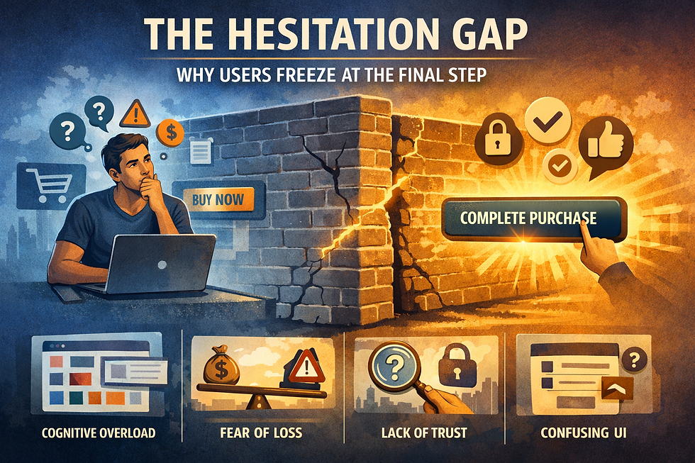
1. Cognitive Overload: When the Brain Taps Out
The human brain has a limited working memory. When a user is evaluating a purchase or sign-up, they're already holding a lot of information in their head — price comparisons, feature trade-offs, whether they actually need this, what their boss will say. The moment your interface adds more cognitive work on top of that, you push them past the tipping point.
This manifests in several ways:
Too many choices on the page. Barry Schwartz's "paradox of choice" isn't just theoretical — it plays out in A/B tests every day. Giving users three nearly identical pricing plans with 12 checkmark rows doesn't help them decide. It paralyzes them. They leave to "think about it." They rarely come back.
Jargon and feature-led copy. When copy describes a product in terms of features rather than outcomes, users have to do the translation work themselves. "256-bit AES encryption" means nothing to someone who just wants to know if their files are safe. Every sentence that makes a user pause to decode is a sentence that loses momentum.
Cluttered checkout or form flows. Research from the Baymard Institute shows that 17% of US adults have abandoned a checkout specifically because the process was too long or complicated. The irony: they had their credit card out. They wanted to buy. The interface just wore them down.
What to do: Audit every step of your conversion flow with one question — what cognitive work am I asking the user to do here, and is it necessary? Strip it. Simplify plan comparisons. Lead with outcomes. Shorten forms to the minimum viable fields.
2. Loss Aversion: The Fear of Making the Wrong Call
Nobel laureate Daniel Kahneman's research established that humans feel losses about twice as intensely as equivalent gains. This is baked into how we evaluate decisions — and it means that even when a user wants your product, the fear of being wrong about it can override their desire to have it.
This shows up as:
"What if I regret this?" The user isn't unsure about the value. They're unsure about their own judgment. If your product requires commitment — money, time, data — they start calculating the cost of being wrong.
Asymmetric risk perception. The upside of your product feels uncertain. The downside (wasted money, annoyance, feeling stupid) feels vivid and concrete. Your copy might talk endlessly about the upside, but their brain is running downside scenarios.
Non-refundable or unclear cancellation policies. When users can't see an easy exit, they don't enter. This is counterintuitive to many founders, who fear that a prominent "cancel anytime" promise will lower perceived commitment. The opposite is true. Easy exits lower entry barriers dramatically.
What to do: Make the risk of saying yes feel smaller than the pain of staying stuck. Offer free trials with no credit card required. Make your refund policy loud and friendly, not buried in the footer. Use social proof that specifically addresses regret — "I was nervous at first, but..." testimonials do more work than generic five-star reviews. Reframe guarantees as risk elimination, not as a legal clause.
3. Trust Deficit: The Invisible Conversion Killer
Trust is not one thing. It's a composite signal built from dozens of micro-impressions across your entire interface. And it can be shattered in a second.
Users arrive with varying levels of trust depending on how they found you. Someone who clicked a cold ad has nearly zero baseline trust. Someone referred by a friend starts high. Your interface either builds on or erodes whatever they arrived with.
Trust signals users look for (often unconsciously):
Design quality. A dated, inconsistent, or visually cluttered design registers as a red flag. Users have learned to associate design quality with company credibility — even if that correlation isn't perfectly accurate. A typo in your headline can cost you real conversions.
Real humans. Stock photos of generic smiling people actively reduce trust. Users recognize them immediately and interpret them as a company that has something to hide. Real photos of real team members, real customers, real workplaces — these build credibility.
Third-party proof. An internal claim ("We're the #1 platform for X") carries very little weight. The same claim validated by G2, Trustpilot, a well-known media outlet, or a recognizable customer logo carries enormous weight. The source of the claim matters as much as the claim itself.
Privacy transparency. Users are increasingly aware that submitting a form might mean being added to an email list forever, or having their data sold. A single line — "We'll never share your email. Unsubscribe anytime." — next to your form field can meaningfully improve submission rates.
Security signals. For any transaction involving payment or sensitive data, the absence of visible security signals (SSL indicators, payment logos, security badges) creates uncertainty. Users won't always consciously notice the badge. But they will notice its absence.
What to do: Conduct a trust audit of your conversion pages. For each section, ask: what does this communicate about who we are? Look for anything that introduces doubt — vague claims, corporate-speak, missing human presence, unclear policies. Fix the trust signals before you touch the CTA.
4. Timing Friction: Asking for the Commitment Too Early (or Too Late)
Conversion is not a single moment. It's the culmination of a relationship. When you ask for it at the wrong point in that relationship, you lose people who would have said yes if you'd asked them five minutes later.
The premature ask. Pop-ups that appear the moment a user lands, asking them to subscribe before they've read a single word, are a perfect example of premature commitment requests. The user doesn't yet know if they want a relationship with you. The ask creates friction because it demands a decision before any value has been exchanged.
The moment of peak intent. UX research consistently shows that there are specific moments in a user's journey where their intent to convert spikes. These often coincide with moments of realized value — the "aha moment." For a SaaS product, it might be the moment a user successfully completes their first key action. For an e-commerce site, it might be the moment they finish reading a product description that perfectly describes their problem. Presenting the conversion prompt at this exact moment is dramatically more effective than interrupting the flow earlier.
Decision fatigue. By the end of a long browsing session, a user's willingness to make one more decision drops sharply. If your checkout flow has three steps too many, you may lose people not because they don't want to buy — but because they're mentally exhausted and "I'll do it later" feels like relief.
What to do: Map the moments of highest intent in your user journey. Use behavioral data — where do users who convert linger? What pages do they visit just before converting? Design your conversion asks to appear precisely at those moments. Reduce the number of decisions in your final conversion flow to the absolute minimum.
5. The "Almost Good Enough" Problem
Here's a subtler hesitation driver that rarely gets discussed: the user who almost finds what they need, but not quite.
They land on your pricing page. Three plans. But the features they care about are split across two plans — the cheaper one is missing one key thing, and the expensive one has way more than they need. Instead of picking one, they hesitate. Neither option is right.
Or they're reading your product description and it answers nine out of ten questions they have. The tenth question — "does it integrate with the tool I already use?" — isn't answered anywhere on the page. Rather than ask support (friction), they leave to search for the answer elsewhere. They get distracted. They don't come back.
This is the incomplete information problem. Users need complete confidence to convert. One unanswered question can be enough to pause the whole process.
What to do: Run qualitative research — exit surveys, user interviews, usability tests — specifically designed to surface the questions users have that your page doesn't answer. Even a simple on-exit survey with "What stopped you from [signing up/buying] today?" surfaces gold. Build the answers to those questions directly into your copy. Consider a prominent FAQ section on conversion pages that addresses the top five hesitation-driving questions explicitly.
6. Interface Anxiety: When the UI Itself Creates Doubt
Beyond psychology, the interface itself can cause hesitation through pure functional uncertainty.
Unfamiliar patterns. Users follow conventions. When an interface deviates from expected patterns without a clear reason, it creates micro-moments of confusion. "Where does clicking this take me?" "Will this open a new tab?" "If I add this to my cart, am I committed to buying?" These tiny moments of uncertainty accumulate.
Irreversibility signals. Buttons that use irreversibility-implication language — "Submit," "Confirm," "Finalize" — without a visible undo path create anxiety about making a mistake. Compare this to "Continue" or "Next step," which feel more exploratory and low-stakes.
Form field anxiety. Required fields that seem invasive create resistance. Asking for a phone number when it isn't necessary signals to users that they're going to receive sales calls. Asking for a birth date or company size before establishing trust can feel extractive rather than helpful.
Ambiguous CTAs. A CTA that reads "Get Started" is less effective than one that reads "Start my free 14-day trial." The more specific CTA reduces uncertainty about what happens next. Users hesitate when they don't know exactly what they're agreeing to.
What to do: Audit your CTAs for specificity. Replace vague action words with precise outcome statements. Test your forms by asking — does each field justify its inclusion? Reduce the perceived irreversibility of your conversion steps. Make it clear users can go back, change their mind, and escape without consequences.
7. Social Comparison and FOMO's Reverse: "Am I the Right Person For This?"
FOMO (fear of missing out) is often cited as a conversion driver — and it is. But there's a less-discussed inverse: am I the right person to be doing this?
Users often hesitate not because they doubt the product, but because they doubt themselves as a customer for it. This is especially common in B2B software, premium products, and services perceived as aspirational or advanced.
"Is this for someone like me?" "Will I actually use this, or will I be paying for something I'm not sophisticated enough to use?" "Is this meant for bigger companies?"
When your product or service is positioned in a way that doesn't clearly signal who it's for — or when it signals a customer profile that's slightly off — users who would benefit from it opt out because they don't see themselves in your story.
What to do: Be explicit about who your product is for — and equally explicit about who it's designed to accommodate, even if they're newer or less experienced. Use testimonials and case studies that represent the range of your actual customers. If you serve both small startups and enterprises, show both. Mirror your user's self-perception in your copy, not just your aspiration for who they'll become.
8. The Commitment-Value Mismatch
Every conversion asks the user to give something — money, time, personal data, email address, attention. Every conversion promises something in return. Hesitation happens when the user's perception of what they're giving doesn't feel proportionate to what they're getting.
This mismatch is often a communication problem more than a product problem. The value of what you're offering is real — but you haven't made it tangible enough in the moment of decision.
Vague value propositions ("Supercharge your workflow") don't move the needle at the point of conversion. Specific, concrete, quantified value does. "Cut your reporting time from 4 hours to 20 minutes" is a different conversion experience than "Save time with automated reports."
What to do: Get precise about value. What, specifically, does your product do for the user? In what timeframe? With what measurable outcome? If you don't know, interview customers who've seen results and pull exact language from what they tell you. The specificity of your value claim at the moment of conversion directly impacts conversion rate.
Putting It Together: A Hesitation Audit Framework
As a UX researcher and copywriter, when I approach a conversion optimization project, I run every conversion flow through what I call a hesitation audit — a systematic review of the seven hesitation drivers above.
For each driver, I ask three questions:
Is this driver present? Does the current experience create cognitive overload, loss aversion, trust gaps, timing friction, information gaps, interface anxiety, identity mismatches, or value ambiguity?
How severe is the impact? Some hesitation drivers are minor — they slow users down slightly. Others are fatal — they stop conversion entirely. Prioritize based on severity and frequency.
What's the minimum intervention? Hesitation is often fixed through subtraction, not addition. Remove the friction. Clarify the copy. Simplify the form. Add the missing trust signal. The goal is to make the "yes" feel inevitable.
A Word on Testing
Everything in this article should be treated as hypothesis, not law. Users are contextual beings. What creates hesitation for a user buying a $19 SaaS tool is different from what creates hesitation for someone booking a $3,000 service.
The only way to know which hesitation drivers matter most for your users, in your context, is to test systematically. Run exit surveys. Watch session recordings of users who don't convert. Run A/B tests on specific interventions — add a money-back guarantee and measure lift. Simplify your form and measure completion rates. Rewrite your CTA copy with specificity and watch click-through change.
The users who almost converted are your richest source of insight. They got close enough to tell you exactly what stopped them — if you know how to ask.
Final Thought: Hesitation Is Feedback
The user who wanted to convert but didn't isn't a lost cause. They're a signal. They were interested enough to get close. Something in the experience failed them at the last moment.
That failure is fixable. And fixing it — not by manipulating users, but by genuinely reducing the friction between their intent and their action — is the highest-leverage work in conversion optimization.
The best conversion experiences don't feel like they're trying to convert you. They feel like they're trying to help you make a decision you've already, almost, made.
Written from the combined perspective of UX research practice and conversion copywriting. Grounded in behavioral psychology, usability research, and real-world conversion optimization.
Comments